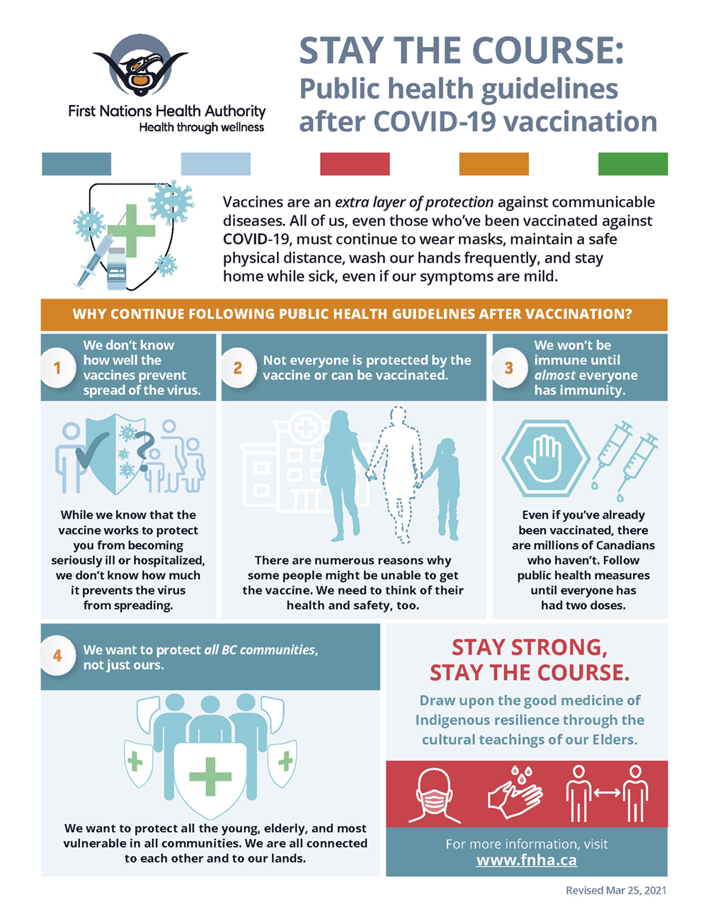
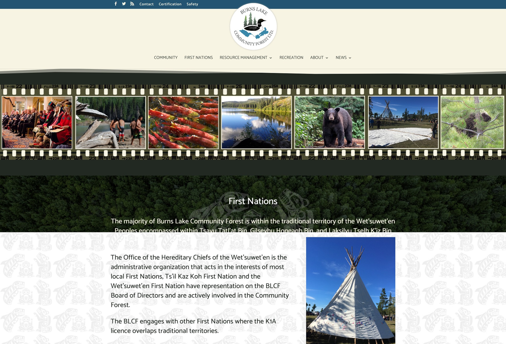
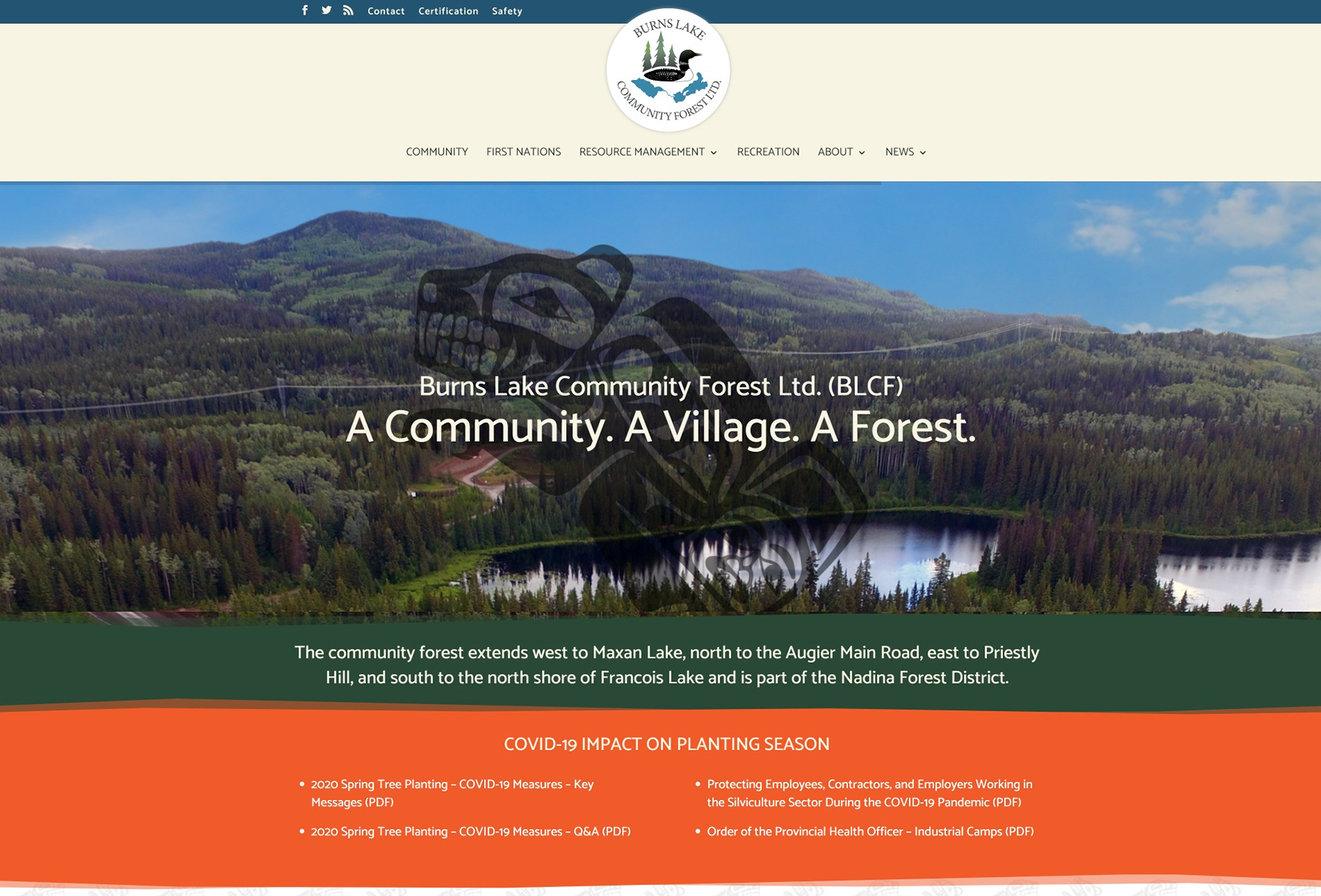
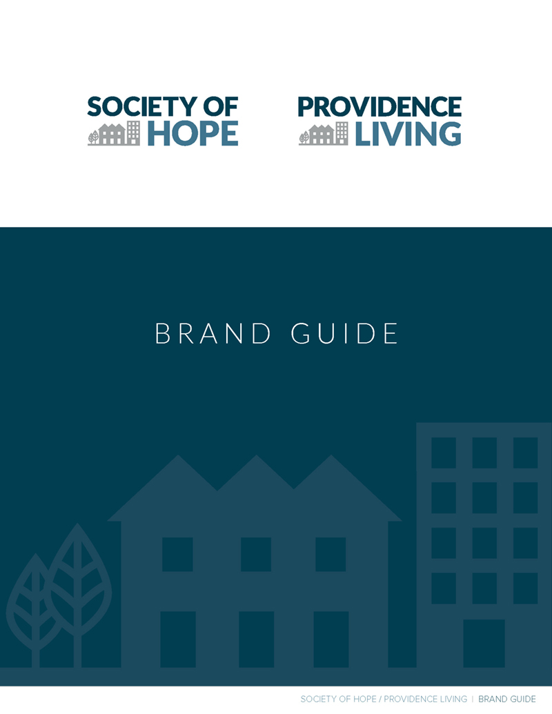
Society of Hope + Providence Living
The Project
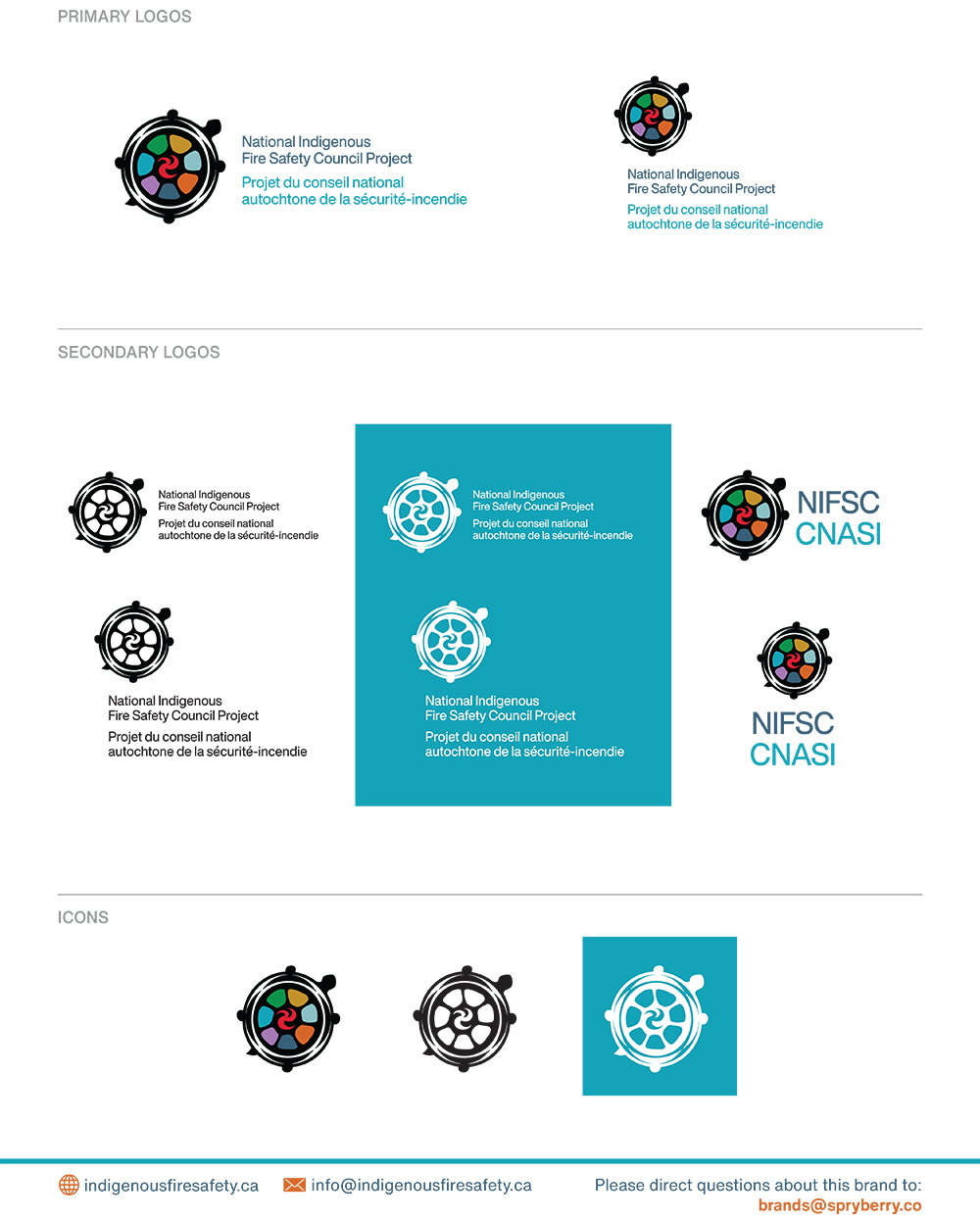
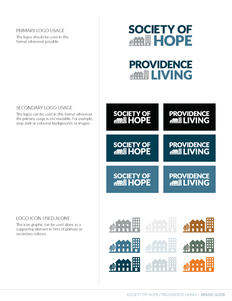
- Rebrand Society of Hope
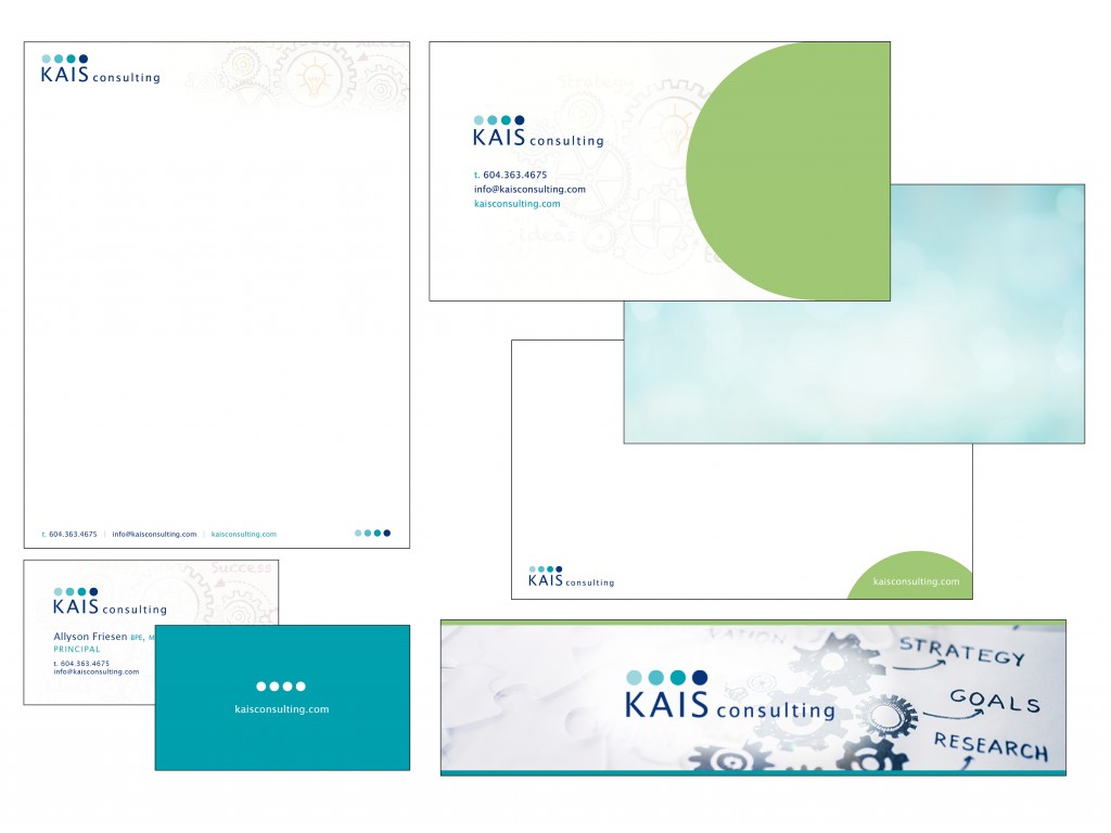
- Logo redesign, brand guidelines
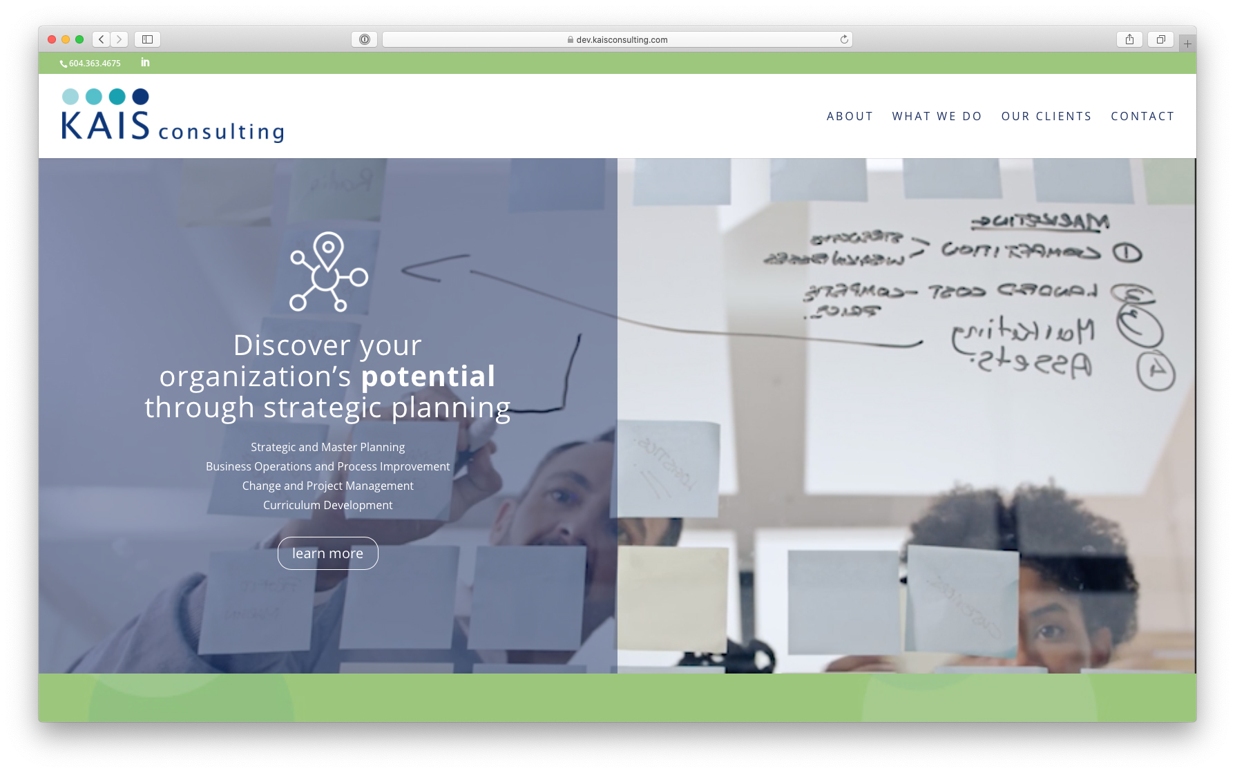
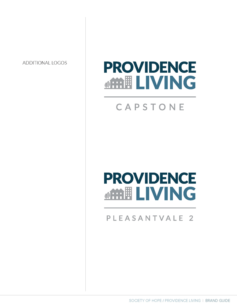
- Sub-brand design – Providence Living
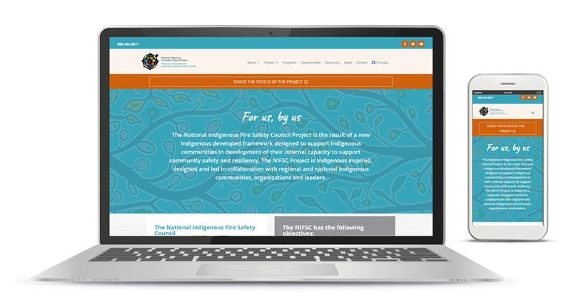
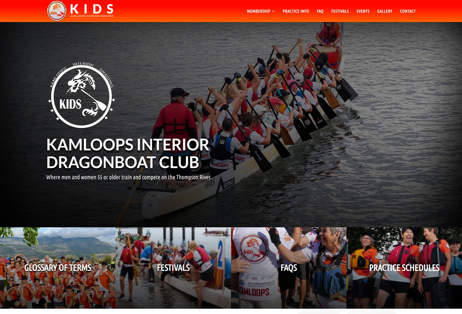
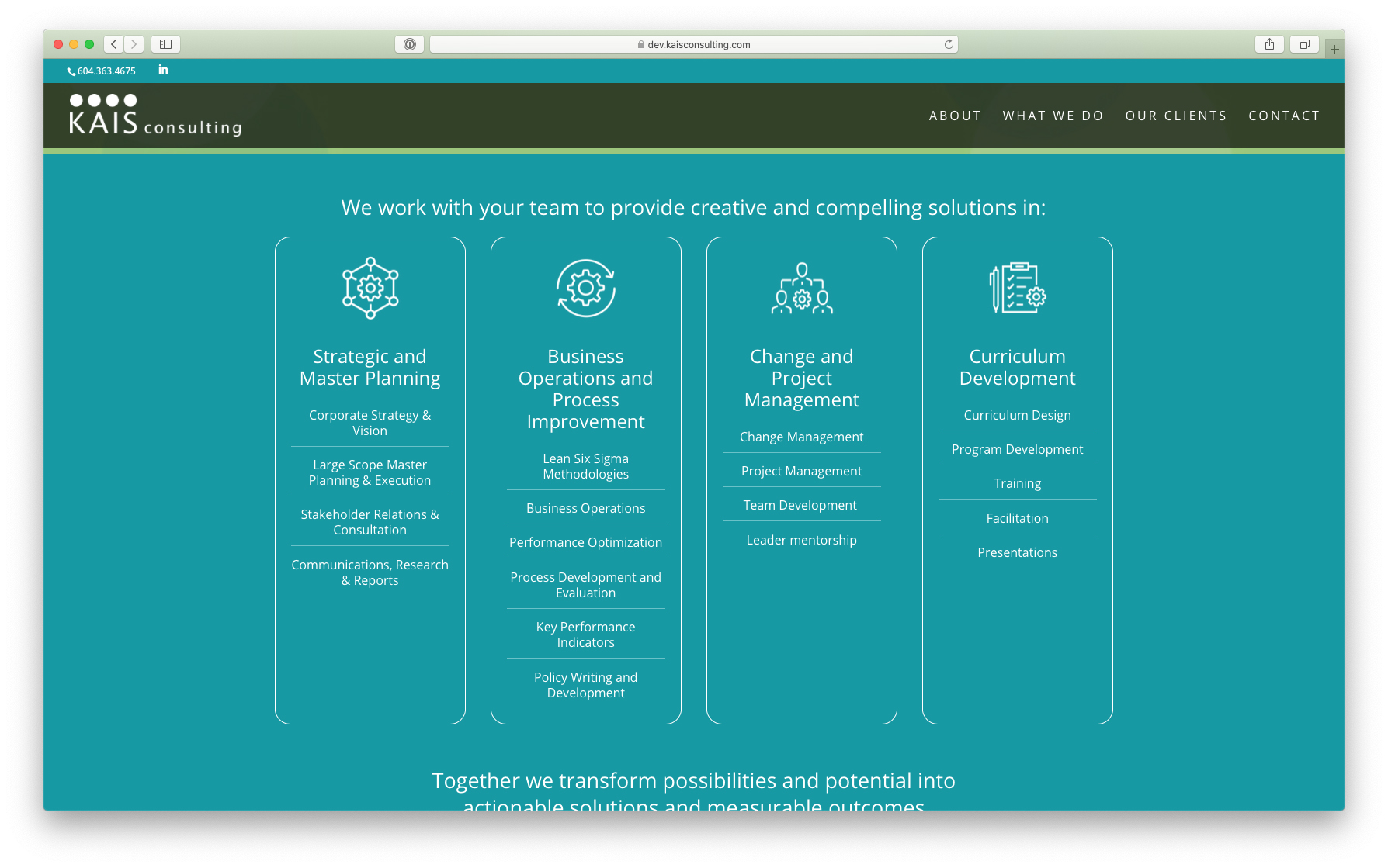
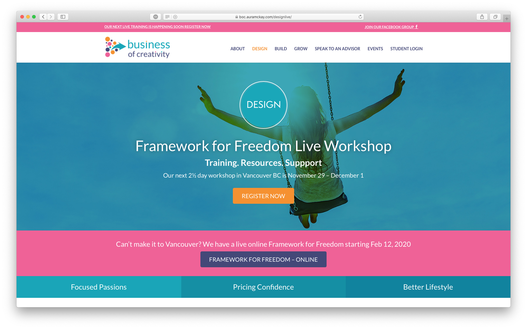
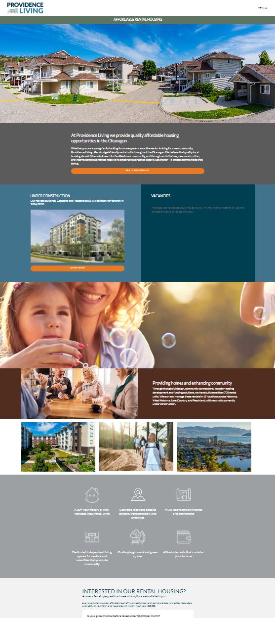
- Web development for Providence Living, the market-facing site for available rental housing
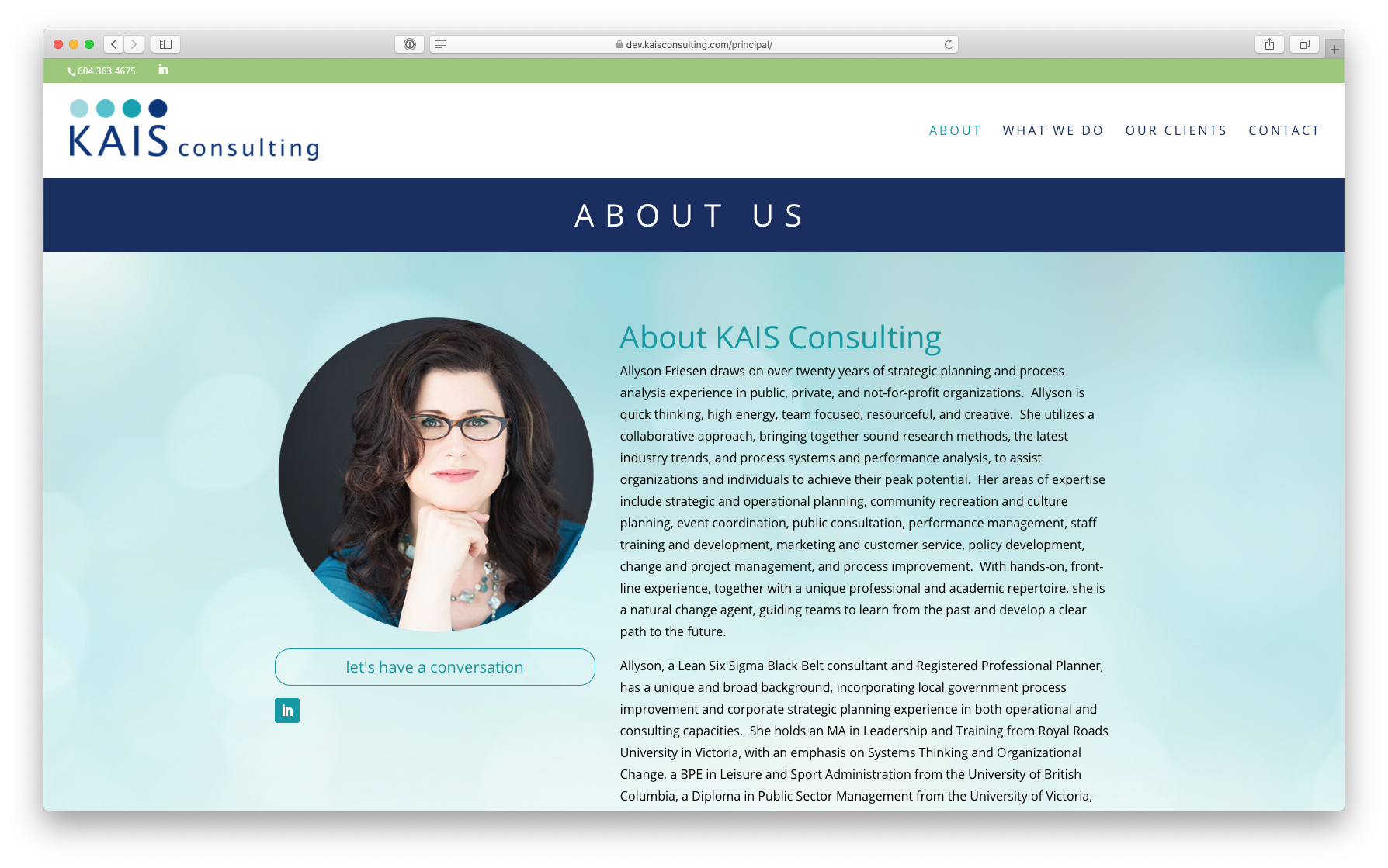
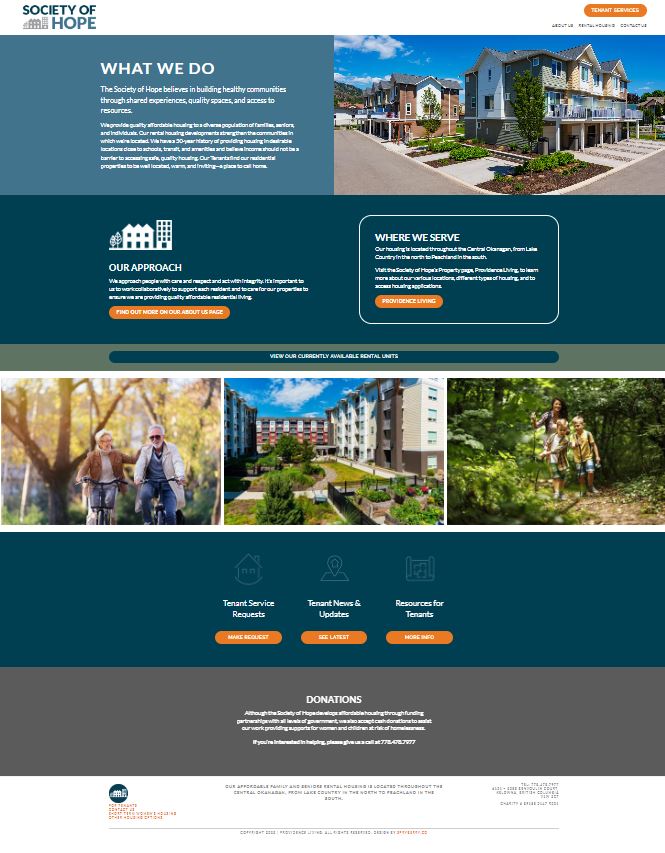
- Strategic redesign of Society of Hope web site for use by current tenants and society business
- Google grant ads setup and management driving traffic to affordable housing options
“The Society of Hope was looking to change our demographic of applicants to better fit our mix of affordable housing units. Our housing stock was a 50/50 combination of deeply subsidized units and market rental affordable units. Previous to our rebranding, 95% of our applicants were only for the deeply subsidized units. This created a challenge to rent the other half of our Market units. We were looking for a way to attract the affordable market unit applicants while directing the deeply subsidized applicants to the Provincial Housing Registry.
We had determined that we did not want to change the Society of Hope name and goodwill it has garnered in public realms. Therefore, we made the decision to develop a sub-brand called Providence Living to act as our rental division to attract market applicants. Spryberry worked with us to develop new logos and marketing artwork, build a website for our rental division, rebuild our outdated Society of Hope website, and connect these all together to provide a platform where we could reach the demographics we were targeting while continuing to assist people find affordable housing.
Spryberry worked collaboratively with our staff to ensure content, look, and functionality were what we wanted and that we received the results we were aiming for. Our staff that were working on this project had very full plates to begin with, and Spryberry worked at their pace and at a level our staff needed. Spryberry took the time to gain knowledge of not only our organization, but also our industry of affordable housing. This allowed them to fully understand our needs and unique challenges. Spryberry was gracious in dealing with our lack of technical knowledge and helped us through things when we didn’t even know what we didn’t know.
Spryberry created two new websites that dovetail very well and provide a huge number of tools for the Society of Hope to continue and grow well into the future. They guided us through, provided training, and we now can keep our web presence up to date. We now have exactly what we were looking for regarding targeting our needed demographics, providing resources for our tenants, and providing direction for the many thousands of people looking for affordable housing. This project has been a complete success!
I would recommend Spryberry time and time again to anyone looking for web design, redesign, or new builds. They are not only very good at what they do, they are passionate about it. Through the entire project it felt like Spryberry was our partner rather than a contractor doing a project for us. Spryberry is our new “go to” in the industry. Thanks Dana and Team!”