Aboriginal Firefighters Association of Canada (AFAC) and National Indigenous Fire Safety Council (NIFSC) Brand, Marketing Materials, and Web
Client
AFAC operates as a consortium of regional First Nations emergency and fire service. They are currently leading the NIFSC project focused on improving fire safety in all First Nations communities across Canada to protect and enhance quality of life, health, and safety.
Challenge
Phase 1
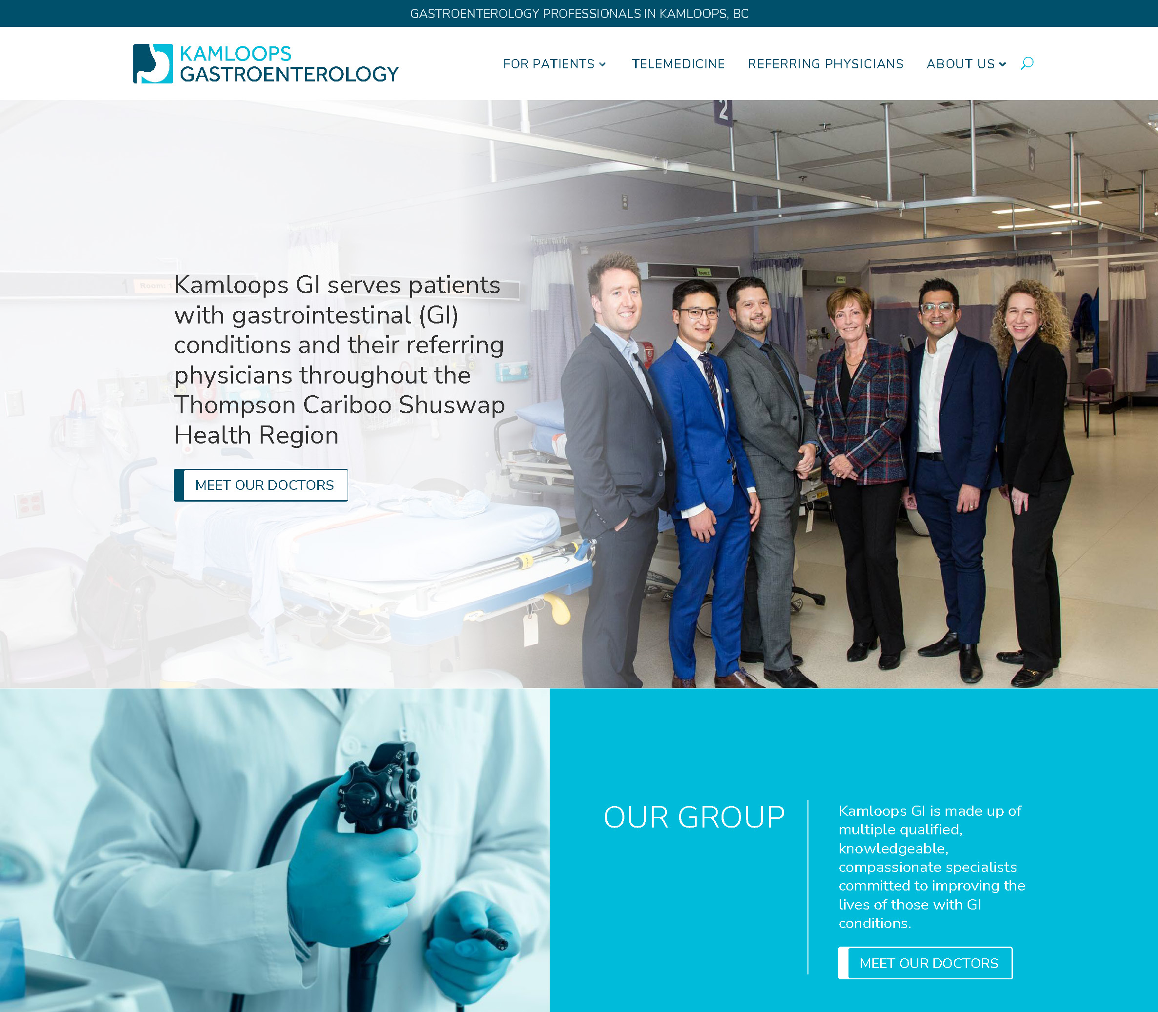
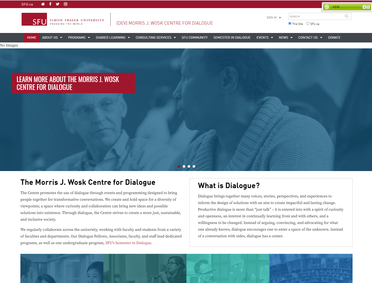
AFAC had a website that didn’t accurately explain their focus and programming. It was difficult to navigate and manage. The dual-language toggle on the site limited the user to choosing French or English at an initial landing page. AFAC also had a separate website for its key program, the Indigenous Fire Marshal Office, that also had problematic structure and design. The separate sites were unnecessarily splitting their audience and causing confusion around the actual organization and program structures.
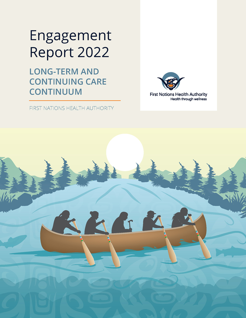
AFAC and IFMO also needed a brand refresh to better align with their goals that focus greatly on fire safety and downplay firefighting. Their newsletters and information packages were disjointed and needed to be brought in line with a new brand direction.
Phase 2
In 2020, IFMO was renamed the National Indigenous Fire Safety Council project to better align with the direction of the project. A completely new brand was undertaken to focus on the project itself. With the project gaining speed and complexity, there is an ongoing need to communicate the purpose and status of the project, and securing support from stakeholders.
Solution
Phase 1
- Comprehensive digital strategy that included SEO research, content strategy, and site mapping to bring the two sites into one and establish the best approach for future development
- Implementation of a robust language toggle allowing users to switch languages on any page
- Responsive design and fast load speed to serve communities with limited internet and cell service
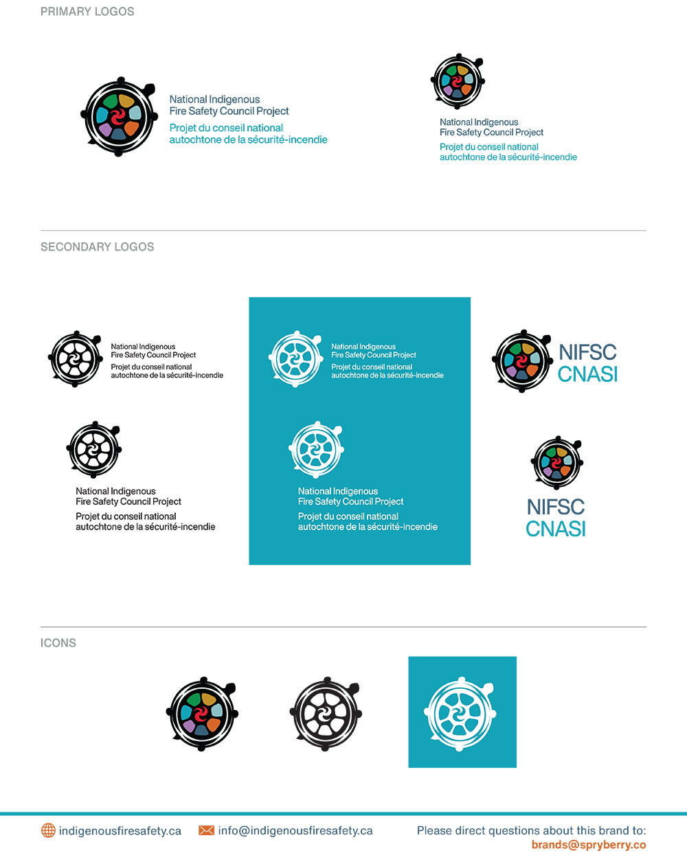
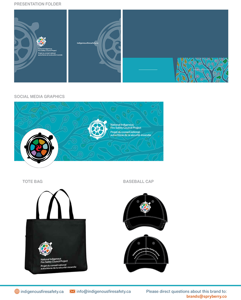
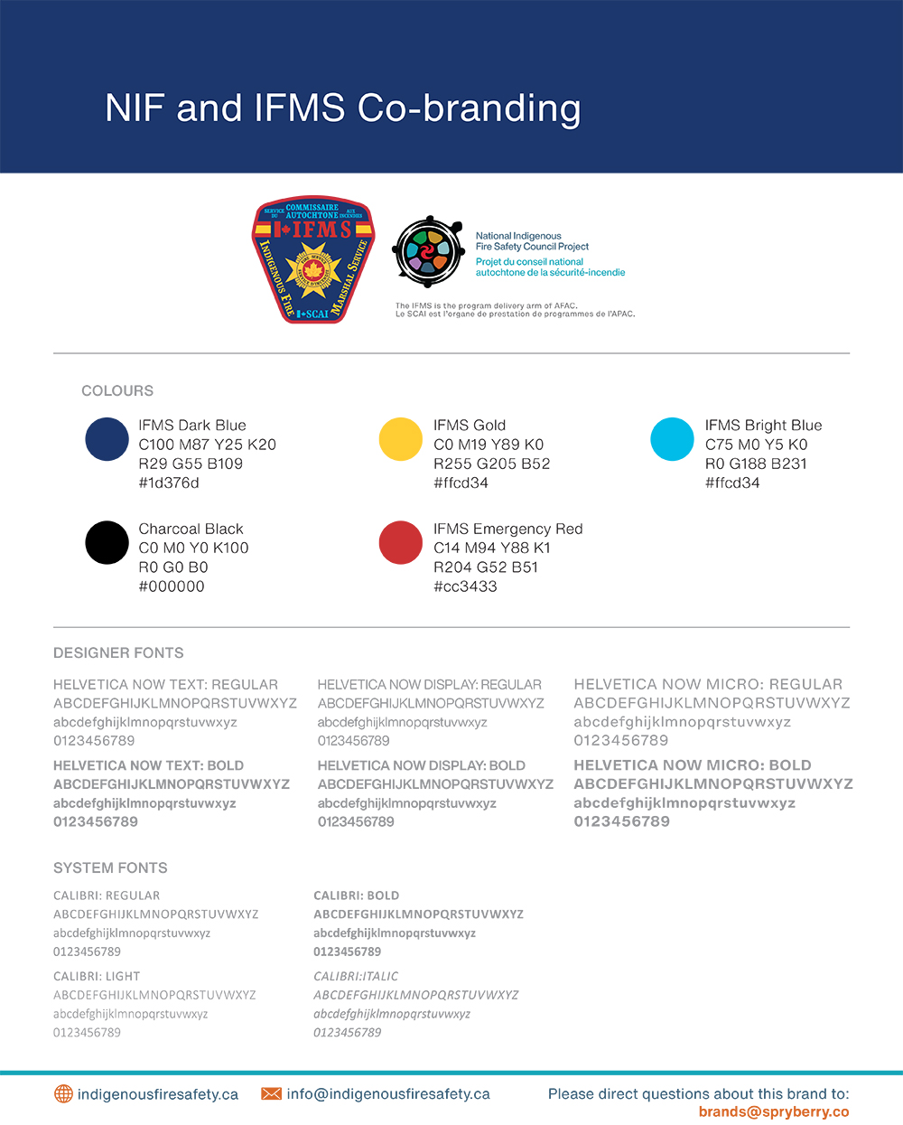
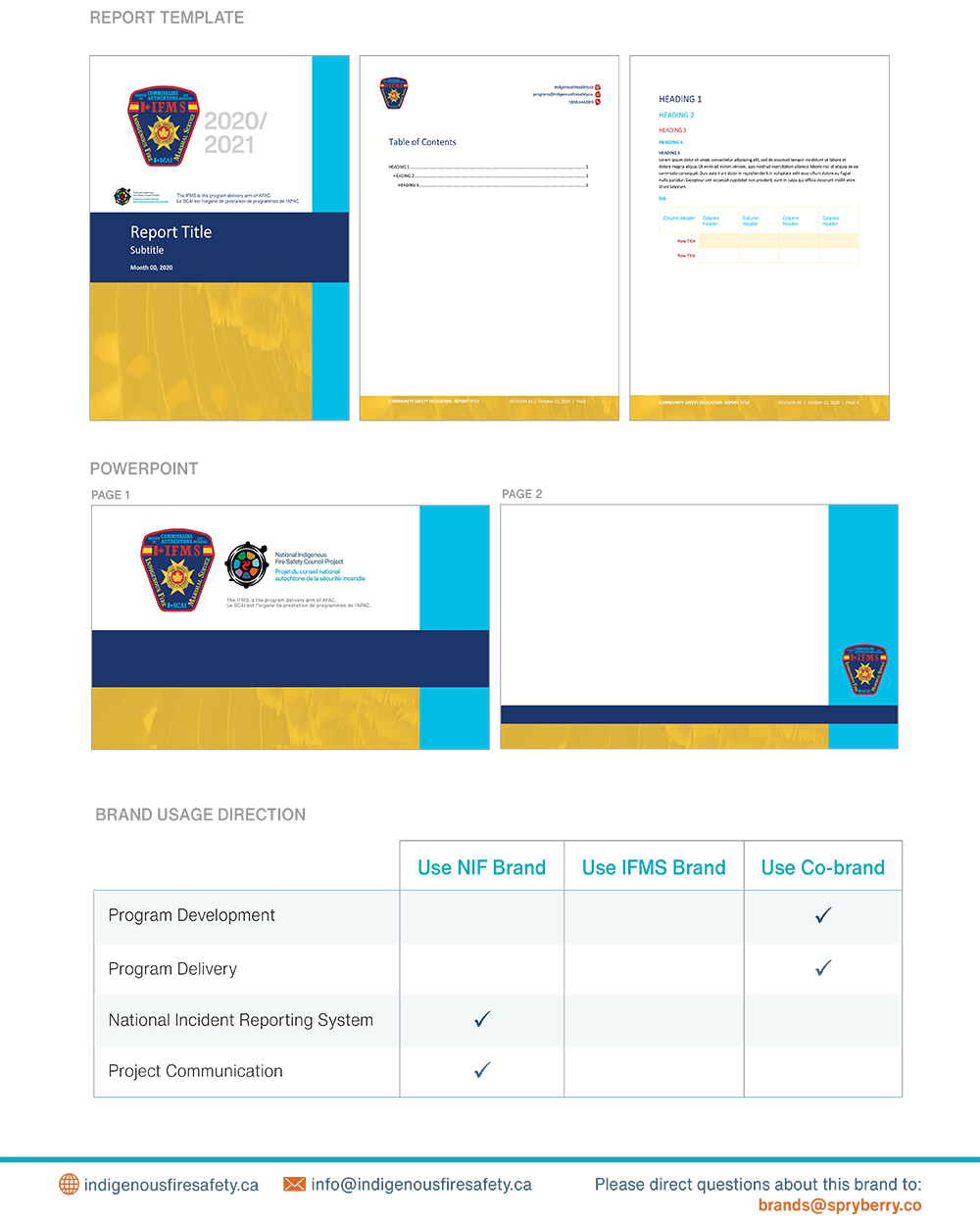
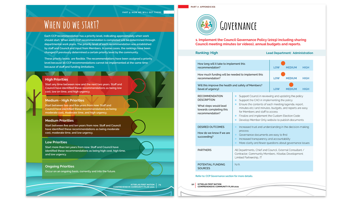
- Brand standard manual and execution across all mediums
Phase 2
- New brand developed for the renamed organization
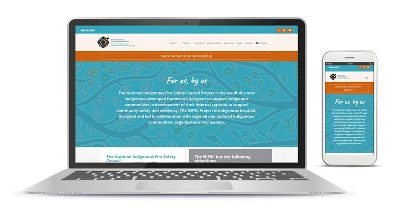
- Digital strategy for the development of NIFSC website focused on the project. Plan for pushing traffic to new site
- Social media awareness campaigns, and campaigns for lead generation and events
Result
Phase 1
A reliable single site that is easy to manage. SEO for the site has improved dramatically since launch, showing better reach and engagement with the site. The brand has been implemented on several print pieces and used across Canada at conferences and meetings.
The new site launch has given the IFMO/AFAC site a new position for 25 key search terms (we started with 0, and it’s growing every week). The new ranked keywords increased monthly search impressions by 816%.
There has been a 1943% (20x) increase in organic search traffic since the new site launched, a change from fewer than a dozen visitors a month to over 300.
Phase 2
- Rebranded site for NIFSC. Increased followers and mailing list by 30%.
- Ongoing social media management on 4 channels.
- Promoted and organized regional stakeholder information sessions — online forum for learning about the project and creating dialogue.
The branding project
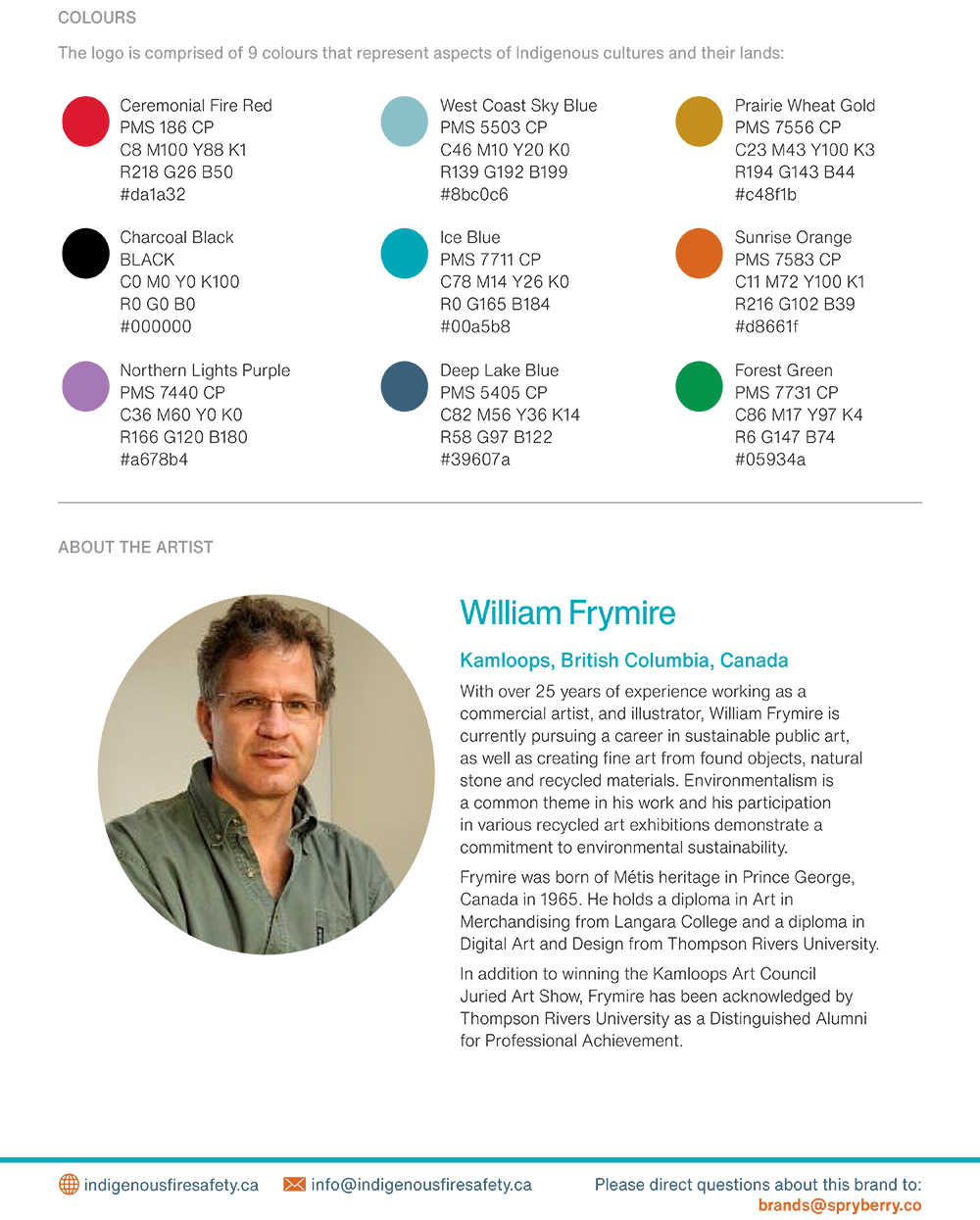
This branding project was scheduled over a four month period to align with meetings of the governing advisory board. The advisory board was comprised of industry professionals from 9 different Indigenous communities representing all regions of Canada. The board was needed to provide direction and vision for the brand. It was Spryberry’s role to find the common ideas that spanned all Peoples and regions as well as representing the purpose of the NIFSC.
We facilitated two branding sessions with the board. Each of the board members provided their insight into their vision of the brand and logo. This was a roundtable discussion with the Elders in the group providing guidance. The ideas put forward reflected the individual’s place on the land, cultural history and stories. Some were similar and others were quite varied.
The board asked us to use an independent Indigenous artist to create the icon for the logo. We selected and then collaborated with the artist in creating five concepts that covered the board’s vision. These were presented to the NIFSC executive director who provided initial feedback.
Four of the concepts were presented to the board. We provided a story for each concept to help align what they were seeing with their vision. The board provided feedback with a request to refine one of the concepts. We worked with the artist to refine the icon and presented a final concept to the board along with a story/explanation of the icon and layouts for the full logo. The final concept was approved unanimously.
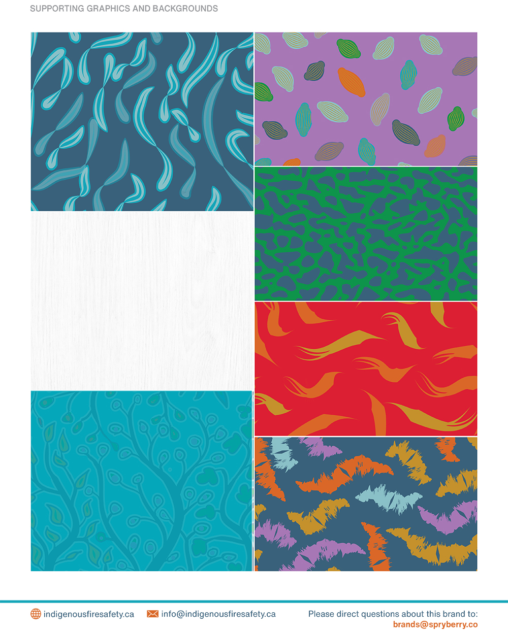
Finally, we worked with the artist to create a series of backgrounds and graphic elements to further build out the brand story to ensure all regions of Canada were reflected in the brand.
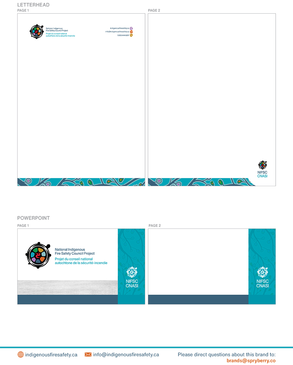
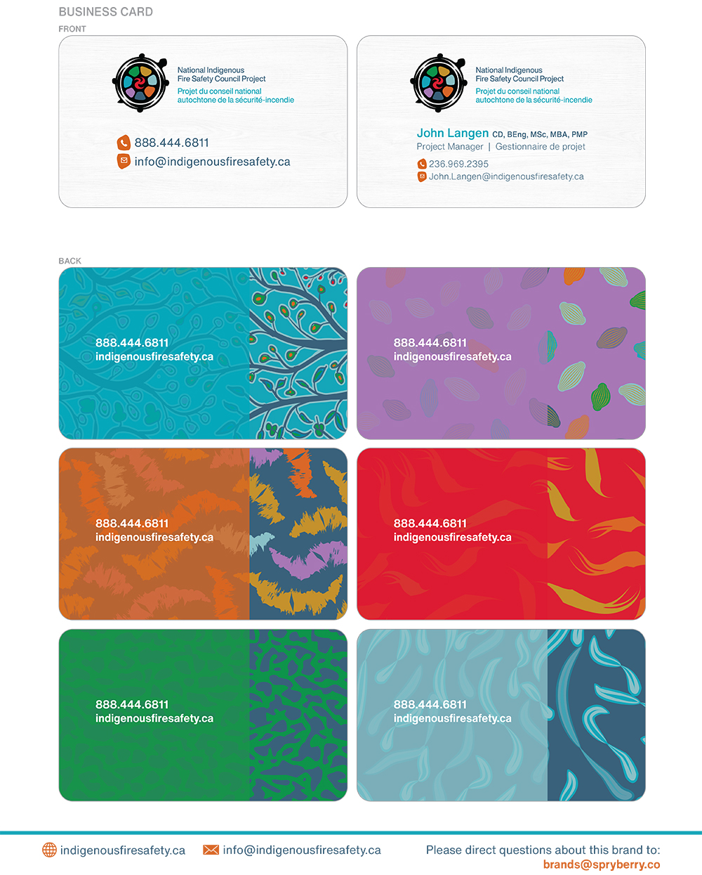
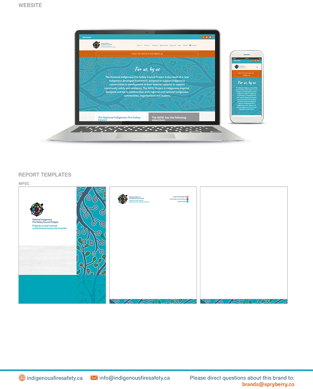
Spryberry put all the elements together into the brand standards and is responsible for ensuring the brand is used consistently throughout the organization. We’ve created numerous templates, the website, and printed materials using the brand.
We enjoyed the opportunity to collaborate and listen to the ideas from the different regions. This was a challenging and fulfilling exercise in getting to know a number Indigenous Peoples and the common threads running through their cultural stories.
Other Services
- Communications planning
- Social media strategy and management
- Production of all content in English/French
- Quarterly newsletter writing, design, production, distribution
- Graphic design for print and web
- Media relations and monitoring
- Management of information updates
- Communications support to IFMO project team
- Reporting on activities and communications
“My organization was looking for a communications partner for the Aboriginal Firefighters Association of Canada Indigenous Fire Marshal Office Project. The project needed a bi-lingual website, as well as print and digital communications with an updated design theme that better reflected our aspirations.
Spryberry helped us define what existing content was superfluous and what we should keep and created consistent language across all mediums. We also asked Spryberry to create brand standards that retained our crests as the centre element. They created brochures, flyers, and designed a beautiful, easy to navigate website that is visually appealing but low-bandwidth friendly.
Spryberry is an amazingly responsive team! They were really good at asking us the right questions and quickly ‘got’ us. We’re delighted with the finished products and we are getting great feedback from our members and beyond. We’ve already recommended Spryberry to others and will continue to do so.”

