First Nations Health Authority Gallery First Nations Health Authority Graphic Design, Indigenous Peoples, Report Design, Social Media First Nations Health Authority Graphic Design, Indigenous Peoples, Report Design, Social Media Alex B2024-04-29T15:45:42-07:00 Learn More
Kitselas First Nation Gallery Kitselas First Nation Indigenous Peoples, Report Design Kitselas First Nation Indigenous Peoples, Report Design Alex B2024-04-29T17:33:02-07:00 Learn More
NIFSC Gallery NIFSC Branding, Graphic Design, Indigenous Peoples, Report Design, SEO, Strategy, Web Design NIFSC Branding, Graphic Design, Indigenous Peoples, Report Design, SEO, Strategy, Web Design Alex B2023-01-09T10:14:16-08:00 Learn More View Project
FHA Quality Care Gallery FHA Quality Care Graphic Design, Health, Report Design FHA Quality Care Graphic Design, Health, Report Design Alex B2020-12-01T14:57:21-08:00 Learn More
Ecotrust Canada Gallery Ecotrust Canada Graphic Design, Report Design Ecotrust Canada Graphic Design, Report Design Alex B2020-12-01T15:02:54-08:00 Learn More
Aboriginal health services Gallery Aboriginal health services Graphic Design, Health, Indigenous Peoples, Report Design Aboriginal health services Graphic Design, Health, Indigenous Peoples, Report Design Dana Koch2026-02-26T14:11:55-08:00 Learn More
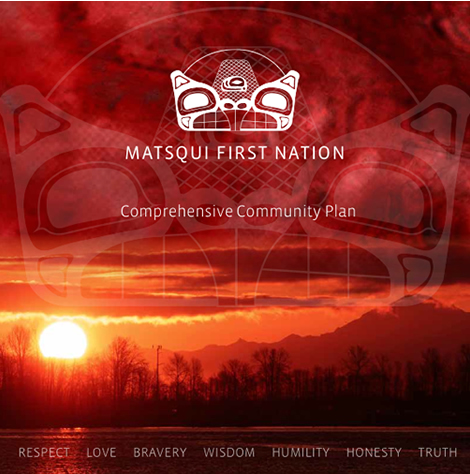
Matsqui First Nation Gallery Matsqui First Nation Indigenous Peoples, Report Design Matsqui First Nation Indigenous Peoples, Report Design Dana Koch2026-02-26T14:14:01-08:00 Learn More
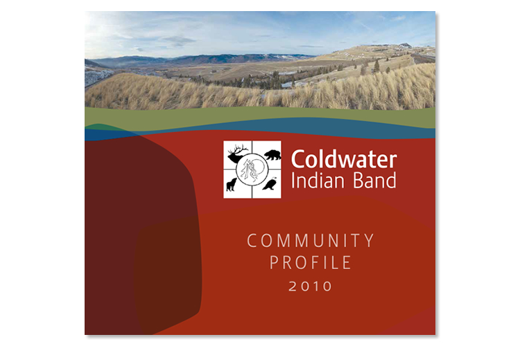
Coldwater indian band Gallery Coldwater indian band Indigenous Peoples, Report Design Coldwater indian band Indigenous Peoples, Report Design Dana Koch2020-12-01T17:29:18-08:00 Learn More
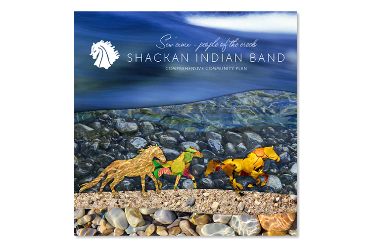
Shackan Indian Band Gallery Shackan Indian Band Indigenous Peoples, Report Design, Resource Sector Shackan Indian Band Indigenous Peoples, Report Design, Resource Sector Dana Koch2026-02-26T14:15:24-08:00 Learn More
four directions management services Gallery four directions management services Indigenous Peoples, Report Design, Strategy, Web Design four directions management services Indigenous Peoples, Report Design, Strategy, Web Design Dana Koch2026-02-26T14:13:26-08:00 Learn More